目录
---------
环境安装
这里使用 yarn 和 expo 安装,yarn 安装速度快且占用磁盘空间小,expo 提供了 web 预览的功能,更容易上手
yarn create expo-app
如果想要使用 web 预览,还需要安装以下几个包:
yarn add react-native-web@~0.18.10 react-dom@18.2.0 @expo/webpack-config@^18.0.1
之后便可以运行 yarn web 启动服务了
如果想要使用 ts,请执行以下命令
npx react-native init MyApp --template react-native-template-typescript
基础
Hello World
与 React 不同的是,ReactNative 采用了 <View> 和 <Text> 标签
import { Text, View } from 'react-native'
export default function App() {
  return (
  	<View style={{
      flex: 1,
      justifyContent: 'center',
      alignItems: 'center'
    }}>
      <Text>Hello World 🎉</Text>
    </View>
  )
}
Core Components
ReactNative 保留了 Native Components,也拥有许多 Core Components,以下介绍基本的 core components:
| RN UI Component | Android view | IOS view | Web analog | 描述 |
|---|---|---|---|---|
<View> | <ViewGroup> | <UIView> | 无滚动 <div> | 默认具有 flex 弹性布局等样式、可处理触摸事件的布局容器 |
<Text> | <TextView> | <UITextView> | <p> | 显示、可样式化、嵌套文本,也可以处理触摸事件 |
<Image> | <ImageView> | <UIImageView> | <img> | 显示图片 |
<ScrollView> | <ScrollView> | <UIScrollView> | <div> | 可以滚动的 <View> |
<TextInput> | <EditText> | <UITextField> | <input type="text"> | 用户可以在此标签元素输入文本内容 |
import { View, Text, ScrollView, Image, TextInput } from 'react-native'
import React from 'react'

export default function CoreComponent() {
  return (
    <ScrollView>
      <Text>文本</Text>
      <View>
        <Text>更多文本</Text>
        <Image
          source={{
            uri: 'https://plumbiu.github.io/blogImg/QQavatar.jpg'
          }}
          style={{width: 200, height: 200}}
        />
      </View>
      <TextInput
        style={{
          height: 40,
          borderColor: 'gray',
          borderWidth: 1
        }}
        defaultValue="请输入文本..."
      >
      </TextInput>
    </ScrollView>
  )
}
Handle TextInput
这个例子逻辑是,当我们输入一串文本,如果多个单词之间有一个空格,那么就会增加一个 🍕
import { View, Text, TextInput } from 'react-native'
import React, { useState } from 'react'

export default function HandleTextInput() {
  const [text, setText] = useState('')
  return (
    <View>
      <TextInput
        onChangeText={word => setText(word)}
        defaultValue={text}
      />
      <Text style={{
        padding: 10,
        fontSize: 50
      }}>
        {
          text.split(' ').map(word => word && '🍕').join(' ')
        }
      </Text>
    </View>
  )
}
常见错误:ode cannot be a child of a <View>. (anonymous) @ index.js:58 (anon,意味着纯文本不能作为 <View> 的内容,需要改为 <Text> 标签
Using ScrollView
ScrollView 相当于 web 中的 <div> 标签
import { View, Text, ScrollView, Image } from 'react-native'
import React from 'react'

export default function UsingScrollView() {
  const words = ['hello world', '你好 世界', 'foo bar']
  const logo = {
    uri: 'https://reactnative.dev/img/tiny_logo.png',
    width: 64,
    height: 64,
  }
  return (
    <ScrollView>
      {words.map(item => (
        <Text key={item} style={{ fontSize: 55 }}>{item}</Text>
      ))}
      <Image source={logo} />
      <Image source={logo} />
      <Image source={logo} />
      <Image source={logo} />
      <Image source={logo} />
      <Image source={logo} />
      <Image source={logo} />
      <Image source={logo} />
      <Image source={logo} />
      <Image source={logo} />
      <Image source={logo} />
      <Image source={logo} />
      <Image source={logo} />
      <Image source={logo} />
      <Image source={logo} />
      <Image source={logo} />
      <Image source={logo} />
    </ScrollView>
  )
}
StyleSheet
StyleSheet 可以使用编写 css 样式表
可以使用 StyleSheet.create 方法创建一个样式表,使用时只需要绑定实例上的属性即可。例如 styles.container
import { View, Text, StyleSheet } from 'react-native'
import React from 'react'
export default function StyleSheetC() {
  return (
    <View style={styles.container}>
      <Text style={styles.title}>
        Hello World
      </Text>
    </View>
  )
}
const styles = StyleSheet.create({
  container: {
    flex: 1,
    padding: 24,
    backgroundColor: '#eafeea'
  },
  title: {
    marginTop: 16,
    paddingVertical: 8,
    borderWidth: 4,
    borderColor: '#20232a',
    borderRadius: 6,
    backgroundColor: '#61dafb',
    color: '#20232a',
    textAlign: 'center',
    fontSize: 30,
    fontWeight: 'bold'
  }
})
Platform
Platform 可以实现不同设备不同功能、样式等。例如在安卓设备背景为蓝色,而在 IOS 设备背景为红色
使用 Platform.select 方法创建对应的样式
import { View, Text, StyleSheet, Platform } from 'react-native'
import React from 'react'

export default function PlatformC() {
  return (
    <View style={styles.container}>
      <Text>PlatformC</Text>
    </View>
  )
}

const styles = StyleSheet.create({
  container: {
    flex: 1,
    ...Platform.select({
      ios: {
        backgroundColor: 'red'
      },
      android: {
        backgroundColor: 'blue'
      },
      default: {
        backgroundColor: 'green'
      }
    })
  }
})
组件
核心组件
View
View 组件时创建 UI 最基础的组件,支持 flexbox 布局、样式、触摸响应和无障碍功能等。View 支持所有平台的原生视图
View 支持嵌套使用
import { View, Text, StyleSheet } from 'react-native'
import React from 'react'

export default function ViewDemo() {
  return (
    <View style={styles.viewContainer}>
      <View style={styles.blueView} />
      <View style={styles.redView} />
      <Text>
        Hello World!
      </Text>
    </View>
  )
}

const styles = StyleSheet.create({
  viewContainer: {
    flexDirection: 'row',
    width: 100,
  },
  blueView: {
    backgroundColor: 'blue',
    width: 50
  },
  redView: {
    backgroundColor: 'red',
    width: 30
  }
})
ScrollView
滚动视图组件,ScrollView 必须有一个确定的高度才能工作
我们可以直接给 ScrollView 一个确定的高度,虽然这是不建议的,所以一般设置样式为 flex: 1
import { View, Text, ScrollView, StyleSheet } from 'react-native'
import React from 'react'

export default function ScrollViewDemo() {
  return (
    <View style={styles.container}>
      <ScrollView style={styles.scrollView}>
        <Text style={styles.text}>
          Lorem ipsum dolor sit amet, consectetur adipiscing elit, sed do
          eiusmod tempor incididunt ut labore et dolore magna aliqua. Ut enim ad
          minim veniam, quis nostrud exercitation ullamco laboris nisi ut
          aliquip ex ea commodo consequat. Duis aute irure dolor in
          reprehenderit in voluptate velit esse cillum dolore eu fugiat nulla
          pariatur. Excepteur sint occaecat cupidatat non proident, sunt in
          culpa qui officia deserunt mollit anim id est laborum.
        </Text>
      </ScrollView>
    </View>
  )
}

const styles = StyleSheet.create({
  container: {
    flex: 1,
    width: '100vw'
  },
  scrollView: {
    marginHorizontal: 20,
  },
  text: {
    fontSize: 42
  }
})
Switch
跨平台通用的“开关组件”
-
trackColor:圆圈的颜色,可以传递一个对象,对象包含false和true属性以及对应的颜色值 -
thumbColor:开关横条颜色,通过value属性绑定的值来判断开/关 -
onValueChange:当value绑定的数据变化时触发的函数 -
value:绑定对应的值
import { View, Text, Switch, StyleSheet } from 'react-native'
import React, { useState } from 'react'

export default function SwitchDemo() {
  const [isEnabled, setIsEnabled] = useState(false)
  const toggleSwitch = () => {
    setIsEnabled(prevState => !prevState)
  }
  return (
    <View style={styles.container}>
      <Switch
        style={{ height: 50 }}
        trackColor={{ false: '#767577', true: '#81b0ff' }}
        thumbColor={isEnabled ? '#f5ff4b' : '#f4f3f4'}
        onValueChange={toggleSwitch}
        value={isEnabled}
      />
    </View>
  )
}
const styles = StyleSheet.create({
  container: {
    flex: 1,
    alignItems: 'center',
    justifyContent: 'center'
  }
})
Text
用于显示文本的 React 组件,支持嵌套、样式以及触摸处理
import { View, Text, StyleSheet } from 'react-native'
import React from 'react'

export default function TextDemo() {
  return (
    <View>
      <Text style={styles.baseText}>
        基本文字
        <Text style={styles.innerText}>红色文字</Text>
      </Text>
    </View>
  )
}

const styles = StyleSheet.create({
  baseText: {
    fontWeight: 'bold'
  },
  innerText: {
    color: 'red'
  }
})
TextInput
用户通过键盘输入文本的基本组件
import { View, Text } from 'react-native'
import React, { useState } from 'react'
import { TextInput } from 'react-native'

export default function TextInputDemo() {
  const [text, setText] = useState('')
  return (
    <TextInput
      value={text}
      onChangeText={text => setText(text)}
      style={{ height: 40, borderColor: 'gray', borderWidth: 1 }}
    />
  )
}
KeyboardAvoidingView
用于解决手机上弹出的键盘挡住当前视图的尴尬问题
import { View, Text, KeyboardAvoidingView, Platform, TextInput, Button } from 'react-native'
import React from 'react'

export default function KeyboardAvoidingViewDemo() {
  return (
    <KeyboardAvoidingView
      behavior={ Platform.OS === 'ios' ? 'padding' : 'height' }
    >
      <View>
        <Text>Header</Text>
        <TextInput placeholder='username'></TextInput>
        <Button title='Submit' onPreSS={() => null} />
      </View>
    </KeyboardAvoidingView>
  )
}
Button
按钮组件,具有默认样式
import { View, Button } from 'react-native'
import React from 'react'

export default function ButtonC() {
  return (
    <View>
      <Button
        title='Press me'
        onPress={() => alert('Button was pressed')}
      />
    </View>
  )
}
组件属性:
这里只将一些常见的,其他属性可以参考:Button · React Native
其中 onPress 和 title 是必需的
| 属性名 | 类型 | 默认值 | 描述 |
|---|---|---|---|
onPress | Function | 指定按钮点击后的回调函数 | |
title | string | 指定按钮上的文字 | |
accessibilityLabel | string | 给盲人展示功能的辅助功能文本 | |
color | string | Android:‘#2196F3’;iOS:‘#007AFF’ | 指定按钮的背景颜色 |
disabled | bool | false | 按钮是否被禁用 |
Image
用于显示多种不同类型图片的 React 组件,可以显示网络图片、静态资源、临时本地文件以及磁盘上的图片等,也可以展示例如 base64 格式的图片
对于网络图片或者 base64 格式图片需要手动指定尺寸
import { View, Text, Image, StyleSheet } from 'react-native'
import React from 'react'

export default function ImageDemo() {
  return (
    <View>
      <Image
        style={styles.avatar}
        source={{
          uri: 'https://plumbiu.github.io/blogImg/QQavatar.jpg'
        }}
      />
    </View>
  )
}
const styles = StyleSheet.create({
  avatar: {
    width: 50,
    height: 50
  }
})
官方还提供了 require() 方法作为 source 属性的值
source={require('@expo/snack-static/react-native-logo.png')}
ImageBackground
如果我们想要在图片上层显示其他东西,例如文字,可以使用这个组件
import { View, Text, ImageBackground, StyleSheet } from 'react-native'
import React from 'react'

export default function ImageBackgroundDemo() {
  return (
    <View>
      <ImageBackground
        style={styles.avatar}
        source={{
          uri: 'https://plumbiu.github.io/blogImg/QQavatar.jpg'
        }}
      >
        <Text style={styles.textInsideAvatar}>ImageBackgroundDemo</Text>
      </ImageBackground>
    </View>
  )
}

const styles = StyleSheet.create({
  avatar: {
    width: 200,
    height: 200
  },
  textInsideAvatar: {
    height: 50,
    padding: 20,
    color: 'white',
    margin: 'auto',
    backgroundColor: 'rgba(0, 0, 0, 0.3)',
  }
})
ActivityIndicator
展示 loading 效果,只需要 <ActivityIndicator /> 标签即可
import { View, Text, ActivityIndicator } from 'react-native'
import React from 'react'

export default function ActivityIndicatorC() {
  return (
    <View>
      <ActivityIndicator />
      <ActivityIndicator size="large" />
      <ActivityIndicator size="small" color="#0000ff" />
      <ActivityIndicator size="large" color="#ff0000" />
    </View>
  )
}
组件属性:
| 属性名 | 类型 | 默认值 | 描述 |
|---|---|---|---|
animating | bool | true | 是否显示动画 |
color | color | Anroid: null(系统默认颜色);IOS: ‘#99999’ | 指定加载效果的颜色 |
hidesWhenStopped | bool | true | 指示器在不设置 animating 时什么时候隐藏 |
size | enum(‘small’, ‘large’);Anroid:number | small | 指定加载指示器的大小 |
TouchableHighlight
用于封装一个可以正确响应触摸操作的组件
import { View, Text, TouchableHighlight } from 'react-native'
import React from 'react'

export default function TouchableHighlightDemo() {
  return (
    <TouchableHighlight
      activeOpacity={0.6}
      underlayColor='#dddddd'
      onPress={() => alert('Pressed!')}
    >
      <View>
        <Text>Touch Me</Text>
      </View>
    </TouchableHighlight>
  )
}
TouchableOpacity
用于封装正常响应触摸操作的视图,按下的时候,封装的视图不透明度会降低。
与
TouchableHighlight区别在于没有额外颜色变化,更适用于一般场景
不透明度的变化是通过把子元素封装在一个 Animated.View 中实现的,这个动画视图会被添加到视图层级,极少情况下会影响到布局
import { View, Text, TouchableOpacity, StyleSheet } from 'react-native'
import React, { useState } from 'react'

export default function TouchableOpacityDemo() {
  const [count, setCount] = useState(0)
  return (
    <View style={styles.container}>
      <View>
        <Text style={styles.countText}>{count}</Text>
      </View>
      <TouchableOpacity
        style={styles.btn}
        onPress={() => setCount(count + 1)}
      >
        <Text style={styles.btnText}>Press me</Text>
      </TouchableOpacity>
    </View>
  )
}

const styles = StyleSheet.create({
  container: {
    flex: 1,
    justifyContent: 'center',
    alignItems: 'center'
  },
  countText: {
    marginBottom: 20,
    fontSize: 50
  },
  btn: {
    padding: 10,
    backgroundColor: '#8944fe',
    borderRadius: 10
  },
  btnText: {
    color: '#fff',
    fontSize: 20,
    fontWeight: 'bold'
  }
})
TouchableWithoutFeedback
此组件会使得点击反馈消失,仅支持一个子节点,如果希望有多个,请使用 <View> 包装
Modal
Modal 组件是一个简单的覆盖在其他视图之上显示内容的方式
import React, { useState } from 'react'
import { Modal, StyleSheet, Text, TouchableHighlight, View } from 'react-native'

const ModalDemo = () => {
  const [modalVisible, setModalVisible] = useState(false)
  return (
    <View style={styles.container}>
      <Modal visible={modalVisible} animationType="slide">
        <View style={styles.modalView}>
          <View style={styles.modalContent}>
            <Text style={styles.modalText}>Hello</Text>
            <TouchableHighlight
              activeOpacity={0.85}
              underlayColor="#8755fe"
              onPress={() => setModalVisible(false)}
              style={styles.divBtn}
            >
              <Text style={styles.BasicText}>Hide Modal</Text>
            </TouchableHighlight>
          </View>
        </View>
      </Modal>
      <TouchableHighlight
        activeOpacity={0.85}
        underlayColor="#8755fe"
        onPress={() => setModalVisible(true)}
        style={styles.divBtn}
      >
        <Text style={styles.BasicText}>Show Modal</Text>
      </TouchableHighlight>
    </View>
  )
}

const styles = StyleSheet.create({
  container: {
    flex: 1,
    justifyContent: 'center',
    alignItems: 'center',
    marginTop: 22,
  },
  modalView: {
    flex: 1,
    justifyContent: 'center',
    alignItems: 'center',
  },
  modalContent: {
    padding: 40,
    backgroundColor: 'rgba(0, 0, 0, .1)',
    alignItems: 'center',
    borderRadius: 15
  },
  modalText: {
    fontSize: 50,
    color: '#333',
    marginBottom: 10
  },
  divBtn: {
    padding: 20,
    backgroundColor: '#4554fe',
    justifyContent: 'center',
    borderRadius: 15,
  },
  BasicText: {
    color: 'white',
    fontWeight: 'bold',
  },
})

export default ModalDemo
FlatList
可以呈现简单列表的高性能组件(比起 <VirtualizedList> 更方便)
React Native 为我们提供了两种可以循环渲染的组件,<FlatList> 和 <SectionList>,它们之间的区别是:
<FlatList>:只能渲染简单的数据结构<SectionList>:可以渲染复杂的数据结构
比起 ScrollView,循环渲染组件可以在数据变换后自动渲染页面,并且只渲染可视范围的内容,不会一次性加载所有内容
<FlatList>:
export default function UsingListViews() {
  const flatlistData = [
    { text: 'hello' },
    { text: 'world' },
    { text: 'foo' },
    { text: 'bar' }
  ]
  return (
    <View>
      <FlatList
        data={flatlistData}
        renderItem={({ item }) => <Text key={item.text}>{item.text}</Text>}
      />
    </View>
  )
}
组件属性
其中 renderItem 和 data 必须,为了提高渲染性能,最好加上 keyExtractor 指定唯一 key 值
| 属性名 | 类型 | 描述 |
|---|---|---|
renderItem | function | 渲染文字,具体在表格后介绍 |
data | arr | 要渲染的数据 |
keyExtractor | function | 为每一项指定不重复的 key 值,减少重新渲染的开销 |
ItemSeparatorComponent | component、function、element | 在每项数据之间渲染的组件,但不会在首部和尾部渲染 |
ListEmptyComponent | component、element | 当数据为空时,渲染的组件 |
ListFooterComponent | component、element | 渲染数据最后一项后的组件 |
ListFooterComponentStyle | 样式 | 为 ListFooterComponent 指定样式 |
ListHeaderComponent | component、element | 渲染数据第一项前的组件 |
ListHeaderComponentStyle | View Style | 为 ListHeaderComponent 指定样式 |
columnWrapperStyle | View Style | 当 numColumns 大于 1 是展示的自定义样式 |
extraData | any | 当除 data 以外的数据在 renderItem 中。请在此属性中指定,否则可能导致页面不刷新,比如先赋值到一个新的 Object 或者数组中,然后修改其值 |
horizontal | bool(默认为 false) | 如果为 true,那么将横向渲染组件 |
initialNumToRender | number(默认为 10) | 指定最开始渲染多少的数据项,最好能够填满整个屏幕 |
initialScrollIndex | number | 直接立刻渲染位于位于 initialScrollIndex 位置的元素 |
inverted | bool | 渲染滚动方向,实质是将 scale 变换设置为 -1 |
numColumns | number | 多列布局,必须是 horizontal={false} 非水平模式才可以设置 |
onEndReached | function | 当页面滚动到底部不足 onEndReachedThreshold 触发的回调函数 |
onEndReachedThreshold | number | 决定距离底部多少时触发 onEndReached 回调,例如 0.5 表示距离内容最底部的距离为当前列表空间高度的一半 |
onRefresh | function | 如果设置了此选项,则会在列表头部添加一个标准的 RefreshControl 控件,以实现“下拉刷新”功能,同时需要正确设置 refreshing 属性 |
refreshing | bool | 在等待加载新数据时将此属性设置为 true,列表会显示出一个正在加载的符号 |
removeClippedSubviews | bool(Android 默认为 true) | 对于大列表启用本属性可以提高性能,但有些情况下会有 bug。谨慎使用 |
renderItem
renderItem({
  item: itemT,
  index: number,
  separators: {
    hightlight: () => void;
    unhighlight: () => void;
  	updateProps: (select: 'leading' | 'trailing', newProps: any) => void
  }
}): JSX.Element
SectionList
可以实现更复杂的结构,如果不需要分组(sction),请使用 <FlatList>
<SectionList> 使用 sections 绑定值,要求绑定值必须含有 data 属性,并且是个数组。
-
渲染
data使用renderItem属性。 -
渲染
header可以使用renderSectionHeader属性 -
使用
keyExtractor为每个循环渲染组件绑定key值,如果数据项中已经包含 key 或者 id 属性,则不需要指定,因为 React Native 会自动判断绑定
import { View, Text, SectionList, StyleSheet } from 'react-native'
import React from 'react'

export default function SectionListDemo() {
  const sectionList = [
    { id: '1', title: 'one', data: ['1', '一'] },
    { id: '2', title: 'two', data: ['2', '二'] },
    { id: '3', title: 'three', data: ['3', '三'] },
    { id: '4', title: 'four', data: ['4', '四'] }
  ]
  return (
    <SectionList
      sections={sectionList}
      renderItem={({ item }) => (
        <Text>{item}</Text>
      )}
      renderSectionHeader={({ section }) => (
        <Text style={styles.blodText}>{section.title}</Text>
      )}
      // keyExtractor={(item) => item}
    />
  )
}

const styles = StyleSheet.create({
  blodText: {
    fontWeight: 'bold'
  }
})
VirtualizedList
FlatList 和 SectionList 底层实现,VirtualizedList 使用起来更加灵活
需要注意的是,只有我们想要非常灵活的渲染时(例如数据结构非常复杂),才会用到这个组件
RefreshControl
可以用于 ScrollView 或者 FlatList 组件内部,目的是添加下拉刷新功能
ScrollView 和 FlatList 中有 refreshControl 属性,可以传递 <RefreshControl> 控件,此组件有最基本的两个属性:
refreshing:视图是否显示指示器,一般在onRefresh回调函数中设置值,类型为 boolonRefresh:视图开始刷新时开始调用,类型为函数
import {
  View,
  Text,
  ScrollView,
  RefreshControl,
  StyleSheet,
} from 'react-native'
import React, { useState } from 'react'

export default function RefreshControlDemo() {
  const [isRefresh, setIsRefresh] = useState(false)
  const handleRefresh = () => {
    setIsRefresh(true)
    setTimeout(() => {
      setIsRefresh(false)
    }, 2000)
  }
  return (
    <View style={styles.container}>
      <ScrollView
        refreshControl={<RefreshControl refreshing={isRefresh} onRefresh={handleRefresh} />}
      >
        <Text>Pull Down</Text>
      </ScrollView>
    </View>
  )
}

const styles = StyleSheet.create({
  container: {
    flex: 1,
    backgroundColor: 'skyblue',
    justifyContent: 'center',
    alignItems: 'center',
  }
})
StatusBar
控制手机最上方状态栏的控件,StatusBar 可以在任意视图中加载,并且可以放置多个,后加载的会覆盖先加载的。因此配合状态栏使用时,需要考虑 StatusBar 的放置顺序
import { View, Text, StatusBar, Button, StyleSheet } from 'react-native'
import React, { useState } from 'react'

export default function StatusBarDemp() {
  const sytleTypes = ['default', 'dark-content', 'light-content']
  const [visibleStatusBar, setVisibleStatusBar] = useState(false)
  const [styleStatusBar, setStyleStatusBar] = useState(sytleTypes[0])
  const themeHandler = () => {
    const typeID = sytleTypes.indexOf(styleStatusBar) + 1
    if(typeID === sytleTypes.length)
      setStyleStatusBar(sytleTypes[0])
    else
      setStyleStatusBar(sytleTypes[typeID])
  }
  return (
    <View style={styles.container}>
      <Text>
        <StatusBar
          hidden={visibleStatusBar}
        />
        <StatusBar
          backgroundColor="blue"
          barStyle={styleStatusBar}
        />
        <View>
          <Button
            title={ visibleStatusBar ? 'show statusbar' : 'hide statusbar' }
            onPress={() => setVisibleStatusBar(!visibleStatusBar)}
          />
          <Button
            title='change theme'
            onPress={themeHandler}
          />

        </View>
      </Text>
    </View>
  )
}

const styles = StyleSheet.create({
  container: {
    flex: 1,
    justifyContent: 'center',
    alignItems: 'center'
  }
})
Pressable
Pressable 是可以检测任意子组件不同阶段的按压交互情况的组件,也可以用于解决用户不小心按错了出发区域
Pressable 的属性:
onPressIn:按压时调用onPressOut:再按压动作结束后被调用
在按下 onPressIn 后,将会出现如下两种情况之一:
- 用户移开手指,依次触发
onPressOut和onPress事件 - 按压持续 500ms 以上,触发
onLongPress事件(之后onPressOut在手指移开后依次触发)

同时,Pressable 还提供了可选属性 HitRect,可以用来定义相对于包裹元素的有效触发距离
触发区域不会超过绑定的父级 view,在按压到重叠的兄弟视图时,z-index 更高的那个视图会优先

用 hitSlop 设置 HitRect; 用 pressRetentionOffset 设置 PressRect;
Pressable使用了 React Native 的PressabilityAPI。查看Pressability示例,获取更多关于 Pressability 的状态机流程和原理。
import { View, Text, Button, StyleSheet } from 'react-native'
import React, { useState } from 'react'
import { Pressable } from 'react-native'

export default function PressableDemo() {
  const [counter, setCounter] = useState(0)
  return (
    <View style={styles.container}>
      <Pressable
        onPress={() => setCounter(counter + 1)}
        onLongPress={() => setCounter(counter + 2)}
        style={({ pressed }) => [
          {
            backgroundColor: pressed ? 'rgba(120, 20, 240, 1)' : 'rgba(120, 20, 240, 0.5)',
            borderRadius: 25
          }
        ]}
      >
        {({ pressed }) => (
          <Text style={styles.textBtn}>{pressed ? 'Pressed!' : 'Press Me!'}</Text>
        )}
      </Pressable>
      <View style={styles.textContent}>
        <Text>{counter ? `${ counter === 1 ? 'onPress' : `${counter}x onPress` }` : ''}</Text>
      </View>
    </View>
  )
}
const textBasicStyle = {
  width: '100vw',
  textAlign: 'center',
  padding: 15,
  fontSize: 25,
  color: '#fff'
}
const styles = StyleSheet.create({
  container: {
    flex: 1,
    justifyContent: 'center',
    alignItems: 'center',
  },
  textBtn: {
    ...textBasicStyle
  },
  textContent: {
    ...textBasicStyle,
    backgroundColor: 'rgba(200, 200, 200, .35)',
    marginTop: 25,
    fontSize: 20
  }
})
安卓组件
此组件只适用于 Android 设备
DrawerLayoutAndroid
抽屉组件,通常用来导航切换
此组件只能在 Android 上使用,所以更推荐跨平台的
react-navigation中的DrawerNavigation组件来代替该组件
import {
  View,
  Text,
  DrawerLayoutAndroid,
  Button,
  FlatList,
  StyleSheet,
} from 'react-native'
import React, { useState } from 'react'

export default function DrawerLayoutAndroidDemo() {
  const [drawerPosition, setDrawerPosition] = useState('left')
  return (
    <DrawerLayoutAndroid
      drawerWidth={300}
      renderNavigationView={() => (
        <FlatList
          data={[
            { id: 1, name: 'xj', age: 20 },
            { id: 2, name: 'sx', age: 20 },
            { id: 3, name: 'yq', age: 21 },
          ]}
          renderItem={({ item }) => (
            <View style={{...styles.container, ...styles.drawerContainer}}>
              <Text>姓名:{item.name}</Text>
              <Text>年龄:{item.age}</Text>
            </View>
          )}
        />
      )}
      drawerPosition={drawerPosition}
    >
      <View style={styles.container}>
        <Text>The Drawer Position {drawerPosition}</Text>
        <Button
          title="change the drawer position"
          onPress={() =>
            setDrawerPosition(drawerPosition === 'left' ? 'right' : 'left')
          }
        />
      </View>
    </DrawerLayoutAndroid>
  )
}
const styles = StyleSheet.create({
  container: {
    flex: 1,
    justifyContent: 'center',
    alignItems: 'center',
  },
  drawerContainer: {
    marginTop: 25
  }
})
TouchableNativeFeedback
用于正确响应触摸操作的封装视图组件,目前它只支持一个单独的 View 实例作为节点,原生触摸操作反馈的背景可以使用 background 属性来自定义
TouchableNativeFeedback · React Native
iOS 组件
InputAccessoryView · React Native
方法
APIs
Alert
启动一个对话提示框,包含标题和内容信息
import { View, Text, StyleSheet, Button } from 'react-native'
import React from 'react'
import { Alert } from 'react-native'

export default function AlertDemo() {
  function createBtnAlert() {
    Alert.alert(
      'Alert 标题',
      'Alert 内容',
      [
        {
          text: 'cancel',
          onPress: () => console.log('cancel!'),
          style: 'cancel'
        },
        { text: 'ok', onPress: () => console.log('ok!!') }
      ]
    )
  }
  return (
    <View style={styles.container}>
      <Button
        title='Press me'
        onPress={createBtnAlert}
      />
    </View>
  )
}
const styles = StyleSheet.create({
  container: {
    flex: 1,
    justifyContent: 'center',
    alignItems: 'center'
  }
})
Animated
该方法用于动画效果,步骤:
new Animated.Value(0)创建一个动画实例
const fadeAdim = new Animated.Value(0)
Animated.View创建一个显示动画的View标签,里面可以写要展示动画的内容,同时可以在该标签的style属性中加上动画实例
<Animated.View style={[
  { opacity: fadeAdim }
]}>
	<Text>动画显示内容</Text>
</Animated.View>
Animated.timing(动画实例, 数据配置项).start() 开始动画
还有
stop方法,该方法可以停止动画
const fadeIn = () => {
	Animated.timing(fadeAdim, {
    toValue: 1, // duration 时间后动画实例的值
    duration: 5000 // 动画持续的时间,单位 ms
  })
}.start()
- 完整代码
import { View, Text, Animated, Button } from 'react-native'
import React, { useRef } from 'react'

export default function AnimatedDemo() {
  const fadeAdim = new Animated.Value(0)
  const fadeIn = () => {
    Animated.timing(fadeAdim, {
      toValue: 1,
      duration: 5000
    }).start()
  }
  const fadeOut = () => {
    Animated.timing(fadeAdim, {
      toValue: 0,
      duration: 5000
    }).start()
  }
  return (
    <View>
      <Animated.View
        style={[
          {
            opacity: fadeAdim
          }
        ]}
      >
        <Text>Animted View</Text>
      </Animated.View>
      <View>
        <Button title="Fade In" onPress={fadeIn} />
        <Button title="Fade Out" onPress={fadeOut} />
      </View>
    </View>
  )
}
注意:请不要直接修改动画值!可以使用
useRefHook 来返回一个可修改的 ref 引用。ref 对象的current属性在初始化时被赋予给定的动画值,且在组件的生命周期内保存不被销毁。
const fadeAdim = useRef(new Animated.Value(0)).current
Appearance
Appearance API 包括用户的一些个性化设置,例如他们的颜色主题等
import { View, Text, Appearance } from 'react-native'
import React from 'react'

export default function AppearanceDemo() {
  const colorScheme = Appearance.getColorScheme()
  return (
    <View>
      <Text>{colorScheme}</Text>
    </View>
  )
}
对应的方法:
getColorScheme()
该方法可以获取用户设置的主题色,有以下几种
| 值 | 说明 |
|---|---|
light | 浅色模式 |
dark | 深色模式 |
null | 用户没有明确指定 |
addChangeListener()
添加监视用户主题色的事件函数
static addChangeListener(
	listener: (preferences: { colorScheme: 'light' | 'dark' | null }) => void
): NativeEventSubscription
AppState
该 API 可以告诉用户当前应用处于前台还是后台,并且内在状态变化时通知用户,有以下状态:
active:应用正在前台运行background:用户在后台运行,可能有以下情况- 用户停留在别的应用中
- 用户停留在桌面
- Android 来说还可能处在另一个
Activity中
- [iOS]
inactive:表示引用正在前后台的切换过程中,或是处在系统的多任务视图,或者处在来电状态中,具体查看 apple 开发文档
import { View, Text } from 'react-native'
import React, { useEffect, useRef, useState } from 'react'
import { AppState } from 'react-native'

export default function AppStateDemo() {
  const appState = useRef(AppState.currentState)
  const [appStateVisible, setAppStateVisible] = useState(appState.current)
  const [words, setWords] = useState('first state')
  useEffect(() => {
    const subsciption = AppState.addEventListener('change', (nextAppState) => {
      if(appState.current.match(/inactive|background/) && nextAppState === 'active') {
        setWords('App has come to the foreground!')
      }
      appState.current = nextAppState
      setAppStateVisible(appState.current)
      console.log('AppState', appState.current)
    })
    return () => {
      subsciption.remove()
    }
  }, [])
  return (
    <View>
      <Text>{words}</Text>
      <Text>Current state is: {appStateVisible}</Text>
    </View>
  )
}
DevSettings
DevSettings 可以在开发模式下对开发者菜单进行一些自定义
方法:
addMenuItem()
static addMenuItem(title: string, handler: () => any)
在开发者菜单中添加一个自定义的菜单项,函数接收参数:
| 参数名 | 类型 |
|---|---|
| title | string |
| handler | function |
DevSettings.addMenuItem('展示 dev', () => {
	Alert.alert('开发环境调用!')
})
reload()
刷新应用,可以直接使用,也可以与用户交互使用
static reload(reason?: string): void
<Button title="Reload" onPress={() => DevSettings}
Dimensions
用户获取设备屏幕的宽高
对于 React 函数组件,更推荐使用
useWindowDimensionsHook API,和Dimensions不同,useWindowDimensions会在屏幕尺寸变化时自动更新
const windowWidth = Dimensions.get('window').width
const windowHeight = Dimensions.get('window').hei
如果考虑折叠设备,可以使用事件监听函数或者 useWindowDimensions
import { View, Text, Dimensions } from 'react-native'
import React, { useState, useEffect } from 'react'

const windowDimensions = Dimensions.get('window')
const screenDimensions = Dimensions.get('screen')

export default function DimensionsDemo() {
  const [dimensions, setDimensions] = useState({
    window: windowDimensions,
    screen: screenDimensions
  })
  useEffect(() => {
    const subscription = Dimensions.addEventListener('change', ({ window, screen }) => {
      setDimensions({ window, screen })
    })
    return () => {
      subscription?.remove()
    }
  }, [])
  return (
    <View>
      <Text>Window Dimensions</Text>
      {
        Object.entries(dimensions.window).map(([key, value]) => (
          <Text key={key}>{key} - {value}</Text>
        ))
      }
      <Text>
        {
          Object.entries(dimensions.screen).map(([key, value]) => (
            <Text key={key}>{key} - {value}</Text>
          ))
        }
      </Text>
    </View>
  )
}
方法:
addEventListener()
添加事件监听函数
static addEventListener(
	type: 'change',
  handler: ({
  	window,
  	screen
  }: DimensionsValue) => void
): EmitterSubscription
`
get
获取设备的尺寸信息,应在 runApplication 之后被执行
static get(dim: 'window' | 'screen'): ScaledSize
ScaledSize:
| 属性名 | 类型 |
|---|---|
| width | number |
| height | number |
| scale | number |
| fontScale | number |
const { height, width } = Dimension.get('window')
Easing
Easing 是一个常见的实现动画的缓冲函数,下面示例中,设置 sectionList 中的数据项 SECTIONS,在其 data 数组中的每一项添加 easing 属性,属性值为 Easing 对应的属性值
动画插值:
所有动画值都可以执行插值(interpolation)操作。插值是将一定范围的输入值映射到另一组不同的输出值
一个简单将范围 0-1 转换为 0-100 的映射操作:
const size = opacity.interpolate({
  inputRange: [0, 1],
  outputRange: [0, 80]
})
此时我们便可以在 Animated.Value 值从 0 变化到 1 时,让宽高度从 0 变为 80:
const opacity = new Animated.Value(0)
const animatedStyle = []
  opacity,
  {
    // 将宽高度设置为 opacity.interpolate 的返回值,即可实现动画开始时,宽高度也跟着一起变化
    width: size,
    height: size
  }
]
动画执行函数:
const animate = easing => {
  Animated.timing(opacity, {
    toValue: 1,
    duration: 1200,
    easing,
    useNativeDriver: true // 启动原生动画驱动
  }).start()
}
import { View, Text, StyleSheet, Easing, SectionList, Animated } from 'react-native'
import React from 'react'

const SECTIONS = [
  {
    title: 'Predefined animations',
    data: [
      { title: 'Bounce', easing: Easing.bounce },
      { title: 'Ease', easing: Easing.ease },
      { title: 'Elastic', easing: Easing.elastic(4) },
    ],
  },
  {
    title: 'Standard functions',
    data: [
      { title: 'Linear', easing: Easing.linear },
      { title: 'Quad', easing: Easing.quad },
      { title: 'Cubic', easing: Easing.cubic },
    ],
  },
  {
    title: 'Additional functions',
    data: [
      {
        title: 'Bezier',
        easing: Easing.bezier(0, 2, 1, -1),
      },
      { title: 'Circle', easing: Easing.circle },
      { title: 'Sin', easing: Easing.sin },
      { title: 'Exp', easing: Easing.exp },
    ],
  },
  {
    title: 'Combinations',
    data: [
      {
        title: 'In + Bounce',
        easing: Easing.in(Easing.bounce),
      },
      {
        title: 'Out + Exp',
        easing: Easing.out(Easing.exp),
      },
      {
        title: 'InOut + Elastic',
        easing: Easing.inOut(Easing.elastic(1)),
      },
    ],
  },
]

export default function EasingDemo() {
  const opacity = new Animated.Value(0)
  const size = opacity.interpolate({
    inputRange: [0, 1],
    outputRange: [0, 80]
  })
  const animatedStyles = [
    styles.animBox,
    {
      opacity,
      width: size,
      height: size
    }
  ]
  const animate = easing => {
    opacity.setValue(0)
    Animated.timing(opacity, {
      toValue: 1,
      duration: 1200,
      easing,
      useNativeDriver: true
    }).start()
  }

  return (
    <View style={styles.container}>
      <View style={styles.animContainer}>
        <Text style={styles.animTitle}>点击不同标题查看动画效果</Text>
        <Animated.View
          style={animatedStyles}
        />
      </View>
      <SectionList
        style={[styles.centerText]}
        sections={SECTIONS}
        renderItem={({ item }) => (
          <Text
            onPress={() => animate(item.easing)}
            style={styles.content}
          >
            {item.title}
          </Text>
        )}
        renderSectionHeader={({ section }) => (
          <Text
            style={styles.title}
          >
            {section.title}
          </Text>
        )}
      />
    </View>
  )
}

const styles = StyleSheet.create({
  container: {
    flex: 1,
    alignItems: 'center',
    justifyContent: 'center',
    textAlign: 'center'
  },
  animContainer: {
    padding: 0,
    width: 200
  },
  animTitle: {
    color: 'purple'
  },
  animBox: {
    marginVertical: 15,
    marginHorizontal: 'auto',
    padding: 20,
    backgroundColor: '#333',
    textAlign: 'center'
  },
  centerText: {
    textAlign: 'center',
  },
  title: {
    fontWeight: 'bold',
    padding: 10,
    backgroundColor: '#666',
    color: 'white',
  },
  content: {
    padding: 4,
  },
})
Keyboard
该 API 可以监听键盘的事件,例如键盘弹出和键盘收回
使用的属性或方法:
Keyboard.dismiss()
把键盘收回去,同时使当前文本框失去焦点
InputText的onSubmitEditing函数
在用户点击确认按钮后触发
import { View, Text, Keyboard, TextInput, StyleSheet } from 'react-native'
import React, { useEffect, useState } from 'react'

export default function KeyboardDemo() {
  const [keyboardStatus, setKeyboardStatus] = useState('')
  useEffect(() => {
    const showSubscription = Keyboard.addListener('keyboardDidShow', () => {
      setKeyboardStatus('Keyboard Shown!')
    })
    const hideSubscription = Keyboard.addListener('keyboardDidHide', () => {
      setKeyboardStatus('Keyboard Hidden!')
    })
    return () => {
      showSubscription.remove()
      hideSubscription.remove()
    }
  }, [])

  return (
    <View style={styles.container}>
      <TextInput
        placeholder='Click here ~~'
        onSubmitEditing={Keyboard.dismiss}
      />
      <Text>{keyboardStatus}</Text>
    </View>
  )
}

const styles = StyleSheet.create({
  container: {
    flex: 1,
    justifyContent: 'center',
    alignItems: 'center'
  }
})
Platform
获取设备有关信息,例如是安卓系统还是 iOS 系统
import { View, Text, ScrollView, Platform } from 'react-native'
import React from 'react'

export default function PlatformDemo() {
  return (
    <ScrollView>
      <Text>OS</Text>
      <Text>{Platform.OS}</Text>
      <Text>{Platform.Version}</Text>
      <Text>isTv</Text>
      <Text>{Platform.isTV.toString()}</Text>
      {
        Platform.OS === 'ios' && (
          <>
            <Text>isPad</Text>
            <Text>{Platform.isPad.toString()}</Text>
          </>
        )
      }
      <Text>Contants</Text>
      <Text>
        {JSON.stringify(Platform.constants, null, 2)}
      </Text>
    </ScrollView>
  )
}
Linking
Linking 提供了一个通用的接口来与传入和传出的 App 链接进行交互,其中 App 链接有以下几种:
| scheme | 说明 |
|---|---|
mailto | 打开邮箱链接,例如 support@expo.io |
tel | 打开电话,例如 tel:+123456789 |
sms | SMS 服务,例如 sms:+123456789 |
https/http | 打开网页链接,例如 https://blog.plumbiu.club |
我们可以通过先分析链接是否支持,如果支持,那么再打开
判断:
const supported = await Linking.canOpenURL(url)
打开链接:
await Linking.openURL(url)
代码:
// 处理点击链接事件的组件
const OpenURLButton = (({ url, children }) => {
  // 处理点击回调函数
  const handlePress = useCalback(async () => {
    // 判断是否支持该链接
  	const supported = await Linking.canOpenURL(url)
  	if(supported) {
    	await Linking.openURL(url)
  	} else {
    	Alert.alert(`此链接 ${url} 不支持`)
  	}
	}, [url])
})
完整代码:
import { View, Linking, Alert, Button } from 'react-native'
import React, { useCallback } from 'react'

const OpenURLButton = (({ url, children }) => {
  const handlePress = useCallback(async () => {
    const supported = await Linking.canOpenURL(url)
    if (supported) {
      await Linking.openURL(url)
    } else {
      Alert.alert(`此链接 ${url} 不支持!`)
    }
  }, [url])
  return <Button title={children} onPress={handlePress} />
})

export default function LinkingDemo() {
  return (
    <View style={styles.container}>
      <OpenURLButton url={'https://blog.plumbiu.club'}>打开支持的链接</OpenURLButton>
      <OpenURLButton url={'slack://open?team=123456"'}>打开不支持的链接</OpenURLButton>
    </View>
  )
}

const styles = StyleSheet.create({
  container: {
    flex: 1,
    justifyContent: 'center',
    alignItems: 'center'
  }
})
PixelRatio
PixelRatio 可以获取到设备的像素密度和字体缩放比
如果我们在一个高像素密度的设备上,显示的图片也应当更高,一个取得缩略图的好规则就是将显示尺寸乘像素密度比:
const size = 50;
const cat = {
  uri: 'https://reactnative.dev/docs/assets/p_cat1.png',
  width: size,
  height: size,
};
const demo = () => {
  <Image
  	source={cat}
    style={{
      width: PixelRatio.getPixelSizeForLayoutSize(size),
        height
    }}
  />
}
export default demo
使用到的方法:
get
static get(): number
返回设备的像素密度,常见设备的像素密度:
| 设备名称 | 像素密度(PixelRatio.get()) |
|---|---|
| mdpi Android devices | 1 |
| hdpi Android devices | 1.5 |
| iPhone SE、6S、7、8、iPhone XR、iPhone 11、xhdpi Android devices | 2 |
| iPhone 6S Plus、7 Plus、8 Plus、iPhone X、XS、XS Max、iPhone 11 Pro、11 Pro Max、Pixel、Pixel 2 xxhdpi Android deviceshttps://material.io/tools/devices/) | 3 |
| Nexus 6、Pixel XL、Pixel 2 XL、xxxhdpi Android devices | 3.5 |
getFontScale()
static getFontScale(): number
返回字体大小缩放比例
getPixelSizeForLayoutSize()
static getPixelSizeForLayoutSize(layoutSize: number): number
将一个布局尺寸(dp)转换为像素尺寸(px),一定会返回一个整数数值
完整实例代码:
import { View, Text, PixelRatio, StyleSheet } from 'react-native'
import React from 'react'
import { ScrollView } from 'react-native-web'
import { Image } from 'react-native'

const size = 50
const cat = {
  uri: 'https://reactnative.dev/docs/assets/p_cat1.png',
  width: size,
  height: size
}

export default function PixelRatioDemo() {
  return (
    <ScrollView style={{flex: 1}}>
      <View style={styles.container}>
        <Text>Current Pixel Ratio is:</Text>
        <Text style={styles.value}>{PixelRatio.get()}</Text>
      </View>
      <View style={styles.container}>
        <Text>Current Font Scale is:</Text>
        <Text style={styles.value}>{PixelRatio.getFontScale()}</Text>
      </View>
      <View style={styles.container}>
        <Text>On this device images with a layout width of</Text>
        <Text style={styles.value}>{size} px</Text>
        <Image
          source={cat}
        />
      </View>
      <View style={styles.container}>
        <Text>require images with a pixel width of</Text>
        <Text style={styles.value}>
          {PixelRatio.getPixelSizeForLayoutSize(size)} px
        </Text>
        <Image
          source={cat}
          style={{
            width: PixelRatio.getPixelSizeForLayoutSize(size),
            height: PixelRatio.getPixelSizeForLayoutSize(size)
          }}
        />
      </View>
    </ScrollView>
  )
}

const styles = StyleSheet.create({
  container: {
    justifyContent: 'center',
    alignItems: 'center'
  },
  value: {
    fontSize: 24,
    marginBottom: 12,
    marginTop: 4
  }
})
Share
Share 可以调用系统的分享框,有以下方法和属性:
share(content, options)
打开一个对话框分享文本内容,返回一个 Promise 对象
sharedAction
static sharedAction
表示内容已成功分享
dismissedAction
static dismissedAction
表示对话框被取消
完整示例代码:
import { View, Text, Share, StyleSheet, Button } from 'react-native'
import React from 'react'

export default function ShareDemo() {
  const onShare = async () => {
    try {
      const result = await Share.share({
        message: 'React Native | A framework for building native apps using React'
      })
      if(result.action === Share.sharedAction) {
        if(result.activityType) {
          // shared with activity type of result.activityType
        } else {
          // shared
        }
      } else if(result.action === Share.dismissedAction) {
        // dismissed
      }
    } catch(err) {
      alert(err.message)
    }
  }
  return (
    <View style={styles.container}>
      <Button
        onPress={onShare}
        title='share'
      />
    </View>
  )
}
const styles = StyleSheet.create({
  container: {
    flex: 1,
    justifyContent: 'center',
    alignItems: 'center'
  }
})
Android APIs
BackHandler
用于监听设备上的后退按钮事件,此 API 仅能在 Android 上使用
回调函数是倒序执行的(即后添加的函数先执行)
- 如果某一个函数返回 true,则后续的函数都不会被调用
- 如果没有添加任何监听函数,或者所有的监听函数都返回 false,则会执行默认行为,退出应用
注意:如果 app 当前打开了一个
Modal窗口,则BackHandler不会触发事件(Modal文档).
方法:
addEventListener()
为后退事件添加监听函数
static addEventListener(
	eventName: BackPressEventName,
  handler: () => boolean | null | undefined
): NativeEventSubscription
exitApp()
退出应用
static exitApp()
removeEventListener()
移除对后退事件的监听
static removeEventListener(
	eventName: BackPressEventName,
  handler: () => boolean | null | undefined
)
完整代码:
import { View, Text, Alert, BackHandler } from 'react-native'
import React, { useEffect } from 'react'

export default function BackHandlerDemo() {
  useEffect(() => {
    const backAction = () => {
      Alert.alert('Hold on!', 'Are you sure you want to go back?', [
        {
          text: 'Cancel',
          onPress: () => null,
          style: 'cancel'
        },
        {
          text: 'YES',
          onPress: () => BackHandler.exitApp()
        }
      ])
      return true
    }
    const backHandler = BackHandler.addEventListener('hardwareBackPress', backAction)
    return () => {
      backHandler.remove()
    }
  }, [])
  return (
    <View>
      <Text>尝试点击返回键或屏幕两侧滑动</Text>
    </View>
  )
}
PermissionsAndroid
用于规定权限访问的 API,例如 App 会访问你的摄像头权限,此时需要用户来确认是否允许
import { View, Text, PermissionsAndroid, Alert, StyleSheet, Button } from 'react-native'
import React from 'react'

const requestCameraPermission = async () => {
  try {
    const granted = await PermissionsAndroid.request(
      PermissionsAndroid.PERMISSIONS.CAMERA,
      {
        title: '该APP需要你的摄像头权限',
        message: '该APP需要您授权摄像头,为了给您更好地体验',
        buttonNeutral: '以后提醒我',
        buttonNegative: '取消',
        buttonPositive: '确认'
      }
    )
    if(granted === PermissionsAndroid.RESULTS.GRANTED) {
      Alert.alert('现在可以使用摄像头了')
    } else {
      Alert.alert('用户拒绝使用摄像头')
    }
  } catch(err) {
    Alert.alert(err)
  }
}


export default function PermissionsAndroidDemo() {
  return (
    <View style={styles.container}>
      <Text>PermissionsAndroidDemo</Text>
      <Button
        title="获取权限"
        onPress={requestCameraPermission}
      />
    </View>
  )
}

const styles = StyleSheet.create({
  container: {
    flex: 1,
    alignItems: 'center',
    justifyContent: 'center'
  }
})
方法:
check()
static check(permission: Permission): Promise<boolean>
检查某项权限是否经过用户授权,参数 permission 表示要检查的权限,是一个 string
request()
static request(
	permission: Permission,
  rationale?: Rationale
): Promise<PermissionStatus>
弹出提示框向用户请求某项权限。返回一个 promise。
| 名称 | 类型 | 说明 |
|---|---|---|
| permission | string | 要请求的权限 |
| rationale | object | 见下表 |
Rationale:
| 名称 | 类型 | 必需 | 说明 |
|---|---|---|---|
| title | string | 是 | 对话框的标题 |
| message | string | 是 | 对话框的正文 |
| buttonPositive | string | 是 | 同意按钮的文本 |
| buttonNegative | string | 否 | 拒绝按钮的文本 |
| buttonNeutral | string | 否 | 跳过按钮的文本 |
requestMultiple()
static requestMultiple(
	permissions: Permission[],
): Promise<[key in Permission]: PermissionStatus>
在一个弹出框中向用户请求多个权限,返回一个 object,key 为哥哥权限的名字,值为 PermissionsAndroid.RESULTS
参数:
| 名称 | 类型 | 说明 |
|---|---|---|
| permissions | array | 要申请的权限的数组 |
ToastAndroid
用于 Android 设备显示悬浮的提示信息
方法:
show()
static show(message: string, duration: number)
| 函数参数名 | 作用 |
|---|---|
| message | 要显示的文本内容 |
| duration | 显示内容的时间 |
showWithGravity()
static showWithGravity(message: string, duration: number, gravity: number)
grayity 表示要显示的位置,值有 ToastAndroid.TOP、ToastAndroid.BOTTOM、ToastAndroid.CENTER
showWithGravityAndOffset()
static showWithGravityAndOffset(
	message: string,
  duration: number,
  gravity: number,
  xOffset: number,
  yOffset: number
)
可以更加具体的指定 xOffset、yOffset 偏移量
属性:
SHORT、LONG、TOP、BOTTOM、CENTER
均为 number 类型,SHORT、LONG 表示时间的长短、TOP 等表示位置
完整代码
import { View, Text, ToastAndroid, Button, StyleSheet, StatusBar } from 'react-native'
import React from 'react'

export default function ToastAndroidDemo() {
  const showToast = () => {
    ToastAndroid.show('A pikachu appeared nearby !', ToastAndroid.SHORT)
  }
  const showToastWithGravity = () => {
    ToastAndroid.showWithGravity(
      'All You Base Are Belong To Us',
      ToastAndroid.SHORT,
      ToastAndroid.CENTER
    )
  }
  const showToastWithGravityAndOffset = () => {
    ToastAndroid.showWithGravityAndOffset(
      'A wild toast appeared !',
      ToastAndroid.LONG,
      ToastAndroid.BOTTOM,
      25,
      50
    )
  }
  return (
    <View style={styles.container}>
      <Button
        title='Toggle Toast'
        onPress={() => showToast()}
      />
      <Button
        title='Toggle Toast With Gravity'
        onPress={() => showToastWithGravity()}
      />
      <Button
        title='Toggle Toast With Gravity & Offset'
        onPress={() => showToastWithGravityAndOffset()}
      />
    </View>
  )
}

const styles = StyleSheet.create({
  container: {
    flex: 1,
    justifyContent: 'center',
    alignContent: 'center',
    backgroundColor: '#888',
    padding: StatusBar.currentHeight,
    padding: 8
  }
})
iOS APIs
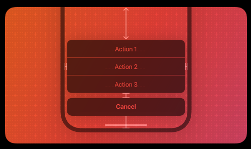
ActionSheetIOS
展示原生 iOS 中 Action Sheet 组件,效果如下:
方法:
showActionSheetWithOptions()
static showActionSheetWithOptions: (
	options: ActionSheetIOSOptions,
  callback: (buttonIndex: number) => void
)
options的参数:
opptions: string[]:一组按钮的文字cancelButtonIndex: number:整数,取消性质的按钮在options中的位置destructiveButtonIndex: number:整数,删除性质的按钮在options中的位置title: string:弹出框顶部的标题message: string:弹出框顶部标题下方的信息tintColor: string:指定删除性质的按钮的文字颜色
callback是一个函数,接收点击按钮的索引值:
ActionSheetIOS.showActionSheetWithOptions({
  options: ['取消', '删除'],
  destructiveButtonIndex: 1,
  cancelButtonIndex: 0,
},
(buttonIndex) => {
	if (buttonIndex === 1) { /* 当接收到的索引为1,即点击了删除按钮时,执行对应操作 */ }
});
showShareActionSheetWithOptions()
在 iOS 设备上显示一个分享弹出框
static showShareActionSheetWithOptions(
  options: ShareActionSheetIOSOptions,
  failureCallback: (error: Error) => void,
  successCallback: (success: boolean, method: string) => void
)
options 参数为一个对象,其属性包含以下几项:
| 属性名 | 类型 | 作用 |
|---|---|---|
| url | string | 分享的链接 |
| message | string | 要分享的信息 |
subject | string | 要分享的信息主题 |
excludedActivityTypes | any[] | 指定在 actionsheet 中部县市的活动 |
failureCallback 表示分享失败后的回调函数
successCallback 表示分享成功后的回调函数,第一个表示是否分享成功,第二个表示分享方式的字符串
DynamicColorIOS
类似 Web 端的 @media(preers-color-scheme: dark)
Settings
Settings是对NSUserDefaults的封装。它是iOS平台上的一种持久的键值对存储
import { View, Text, Settings, Button, StyleSheet } from 'react-native'
import React, { useState } from 'react'

export default function SettingsDemo() {
  const [data, setData] = useState(Settings.get('data'))
  const storeData = data => {
    Settings.set(data)
    setData(Settings.get('data'))
  }
  return (
    <View style={styles.container}>
      <Text style={styles.result}>Stored value:</Text>
      <Text>{data}</Text>
      <Button
        title='Store "React"'
        onPress={() => storeData({ data: 'React' })}
      />
      <Button
        title='Store "Vue"'
        onPress={() => storeData({ data: 'Vue' })}
      />
    </View>
  )
}

const styles = StyleSheet.create({
  container: {
    flex: 1,
    justifyContent: 'center',
  },
  result: {
    fontSize: 64,
    textAlign: 'center',
  },
})
Hooks
useColorScheme
该钩子可以获取系统默认的主题色,有 “light”、“dark”、“null” 三种,其中 null 表示用户没有明确指定主题颜色
useWindowDimensions
可以获取用户设备屏幕的宽高,并且可以在屏幕宽高改变时自动更新,适用于折叠屏,返回值可参考 APIS -> Dimensions
import { View, Text, useWindowDimensions } from 'react-native'
import React from 'react'

export default function UseWindowDimensionsDemo() {

  const dimensions = useWindowDimensions()
  return (
    <View>
      <Text>
        {JSON.stringify(dimensions)}
      </Text>
    </View>
  )
}